

Outdoor paint colours – a big decision, so how do you choose?
Outdoor paint colours are a big decision, not least because the entire world can see the design choices you made … and they can judge, if they want.
So how do you get the right finish for your home, budget, neighborhood, and taste? Not to mention all the different brands of paint.
We’ve come up with a few ‘broad brush’ (sorry!) ideas to guide you, so we truly hope this helps!
Full make over?
It isn’t just the coastal regions that have full masonry paint jobs. Older homes, farmhouses, in fact, anything sat out against the elements, has traditionally needed additional protection from the weather.
If your home was previously painted, and it’s now in need of a new layer of love, you don’t have to feel obliged to use the same shade of colour, as long as there are no planning or historical requirements around this in your immediate area.
But how do you make the choice? Can powder blue ever be right? Or sunshine yellow?
Spot the elements
Certain things around your home’s exterior will likely stay the same for years. Even decades. For example, the steps leading up to the front door; the roof on the house – and even on an attached garage or shed; the general tones of the stone or brick of your area. Take a look at them quite closely. Take photos so you can peer at them later.
Consider how strong or bold the natural colours are. Ask yourself if they’re warm (red brick, hints of pink sandstone) or cool (blue slate, limestone), and consider palettes accordingly. We like to think we’re harmonising the colours when we work with a palette, but the truth is, all palettes need both harmony and complementary colours for the full designer effect.
Make three choices
Three colours is probably as much as anyone needs, and if you’re not painting the masonry, you’ll probably only need two. You don’t want your home to be known locally as the Patchwork House, so it’s safe to say the design mantra ‘less is more’ does apply to exterior paint in most cases.
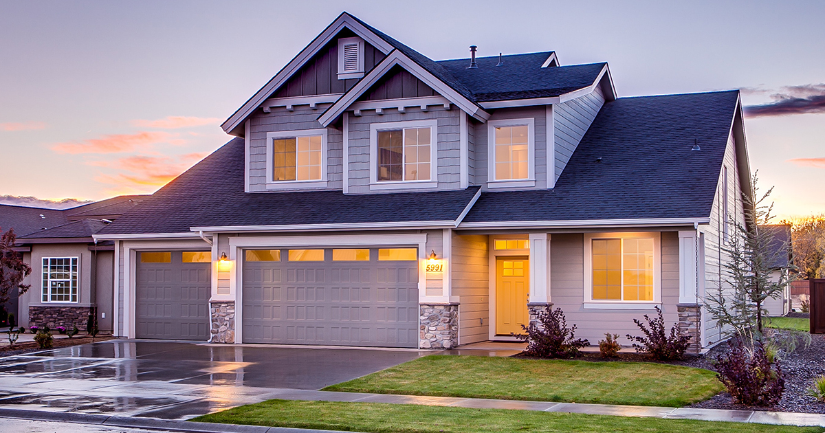
Main colour
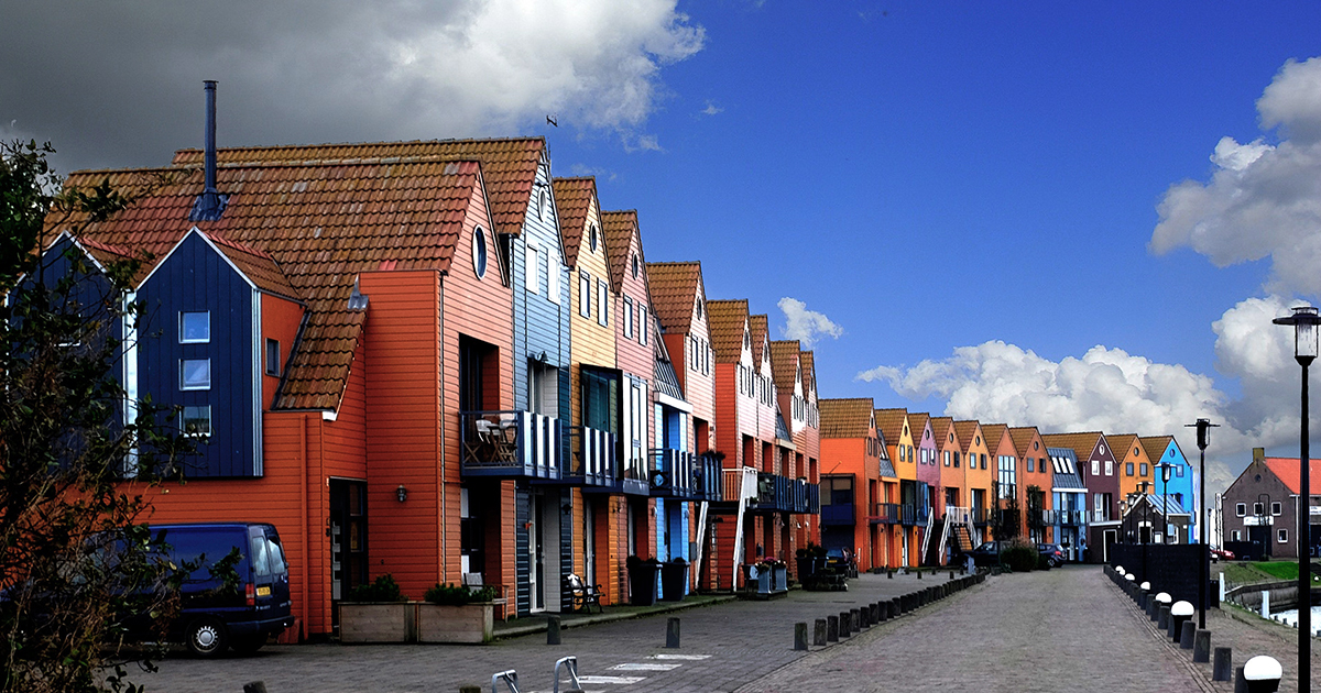
Take a good look at all the other houses on your street, especially if they are the same or similar style to yours. You don’t have to pick the same colours, but the general effect will be better if yours blends gently in without standing out too much. (The trick is not letting it stand out for the wrong reasons).
Think about the tones (blues, greens, creams) rather than the specific colours (cornflower blue, moss green). Instead of trying to match the colour, can you find something unique for your street in the same tonal bracket?
Lighter shades on masonry tend to make a building look more roomy, and their effectiveness can’t be ignored, which is why they’re often tonal ‘classics’. Natural shades, such as pale greens, greys, white and cream tones, all of these can be modernised with the right accent and trim.
If you have an old house, find out what colours it was traditionally painted. Again, you don’t have to go with something exactly the same, but an updated version of the colour it was painted when newly built would freshen it up and make it look very ‘right’.
If you prefer to go for holiday colours, again, erring on light-but-bright shades can work really well, for a well-kept but fun look to the place.
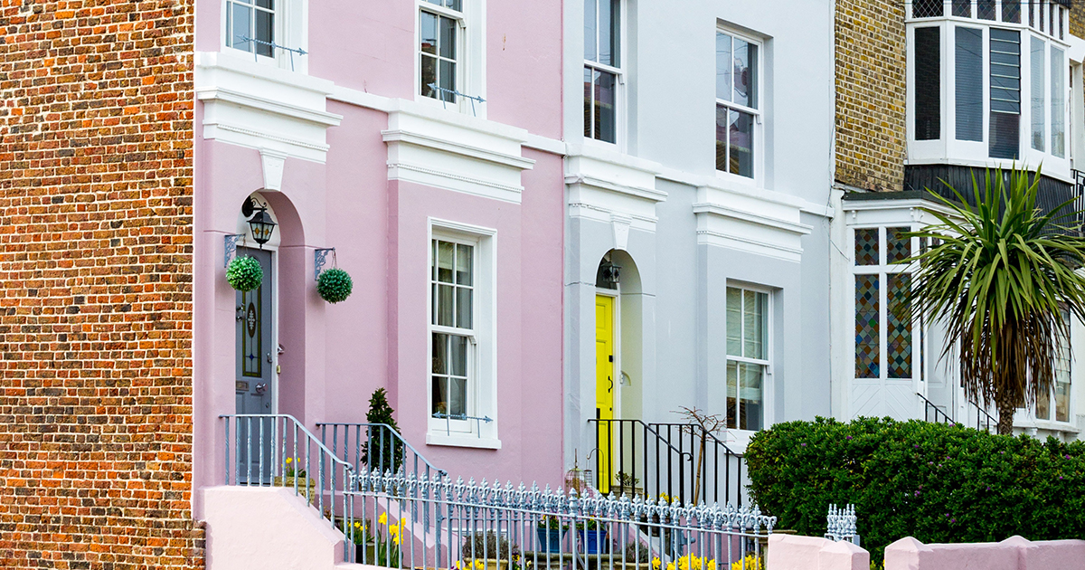
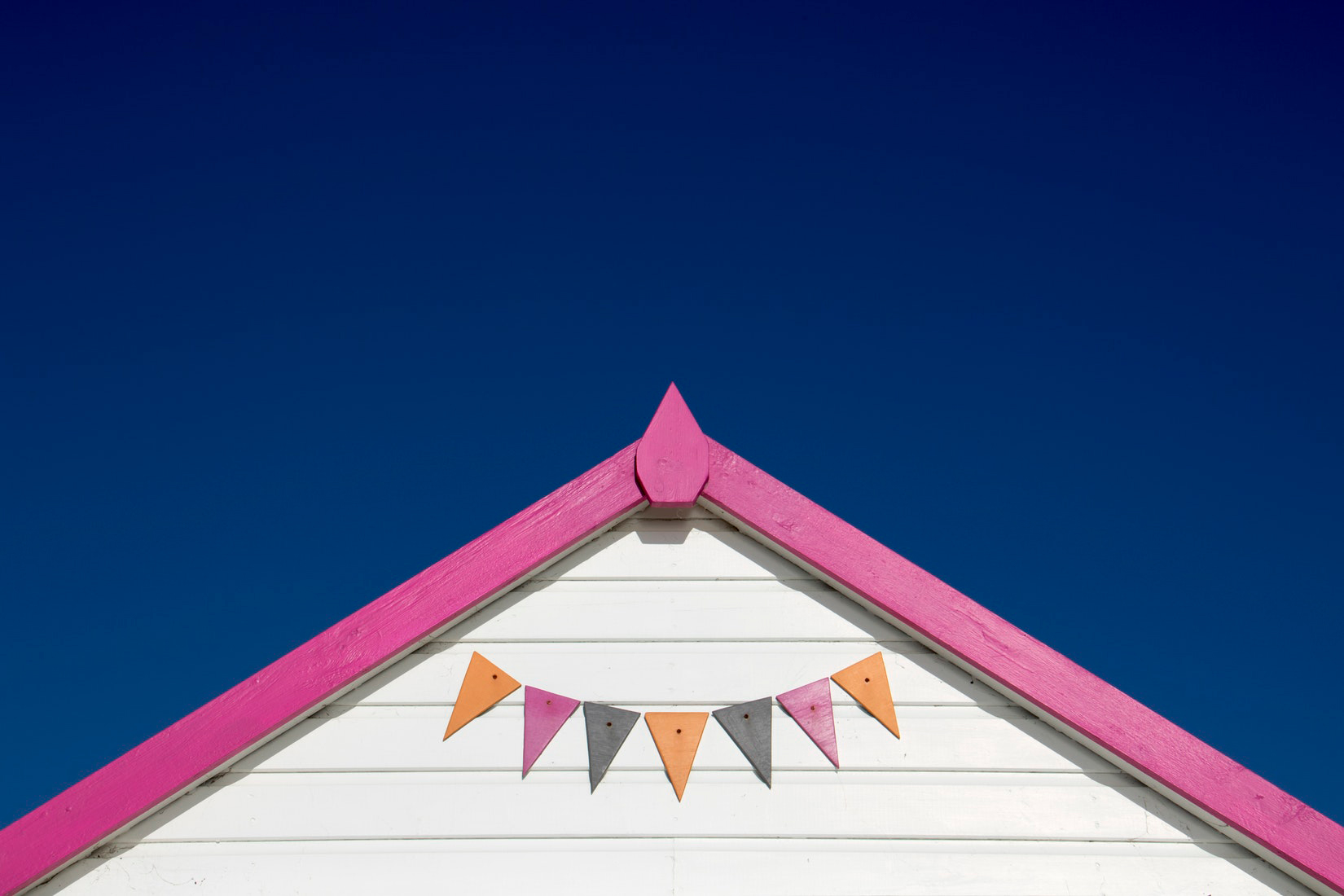
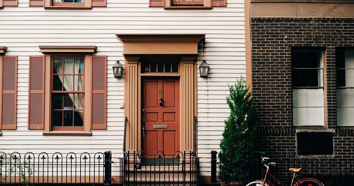
Accent colour
The accent colour does the same job on the outside of your home as it does on the inside: it highlights smaller, fancy bits of design, like the shutters, the doors, and creates a very pleasing, almost balanced effect. For this reason, many people prefer to use a bold or bright colour against an otherwise muted or classic tonal arrangement.
Complementary colours are those that are opposite from each other on the colour wheel. Most importantly, they tend to look very pleasing when brought together in a thoughtful way: purple and green, blue and orange, teal and puce. Sounds garish, and it would be if you made everything half and half, but because you’re only using one of the colours in a minimal way, the result is a home that people want to look at.
What’s more, it doesn’t have to be bright purple and bright green to work (best not, really). You can use a bold colour on the accent, against a more muted classic main colour, to give your home a designed-but-unpretentious attitude.
Trim
Trim is anything left over; usually the woodwork, including window frames, door frame, wooden trim under the roof, that kind of thing. It tends to make the place look cared for. More … finished.
Trim should be a bold contrast from the main colour, but rather than the complementary look, should be found within the range of tones that your main colour came from. A good example is that classic moss green as a main colour, paired with cream or off white as a trim.
You could, however, go dark too. It depends on your choice of accent colour, and how light your main colour is. With a dark or bold main colour, a lighter trim would be a more obvious choice.
Whatever you decide, think as big as you dare, and stand by your finishing choices. It isn’t as though you went to the paint shop blindfolded and just grabbed the first pots you saw. Outdoor paint colours are a big decision, but if it looks great and you love it, it’s yours to make.
Share This Article
WOULD YOU LIKE TO SEE YOUR HOUSE FEATURED ON FINISHED.IE?
Please click on the button bellow and fill the Featured House submission form.


